*By the way, NFL - and especially NBA - MLB just proved it is possible to, you know, negotiate these things in good faith. The deadline was December 11. Why do pro sports leagues feel a need to go on so long, and lockout/strike - especially you, NBA, where your season is perilously close to being flushed down the toilet?
There are plenty of things to talk about in baseball this week as major changes are clearly afoot. You know what caught my eye more than anything this week though?
Uniforms.
In the past week and one day, five different teams have announced uniform changes. If you crave in-depth analysis on a regular basis about what teams wear, Uni Watch is the unquestioned authority. Still, I've got my two cents to add, because an emerging trend has become the new fashion statement. Bright is back in style in baseball.
Let's look at the new uniforms, starting with the Miami Marlins:
Old:

New:

Next up are the San Diego Padres.
Old:

New:
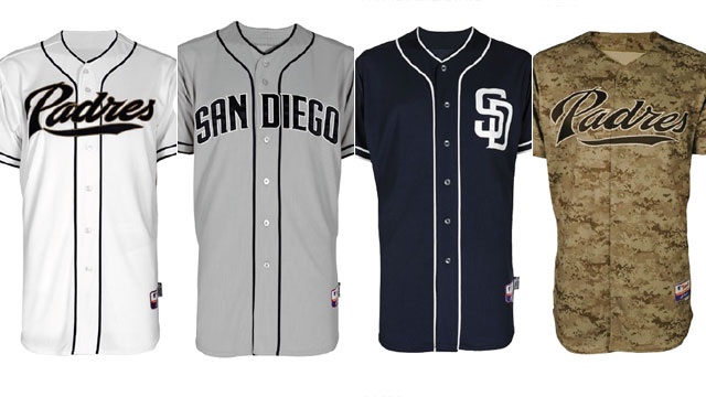
These are the textbook definition of uniform tweaks. I think they improved, but I never really liked their latest set of uniforms in the first place. They are not following the trend towards brighter uniforms, which seems to break my theory. However, based on reactions around the internet, people wish the Padres would have done much more. The message is loud and clear - brighter is better these days.
The Mets got the message with their uniform tweaks:
Old:

New:

Quite simply, the black is gone. Again, a shift from darker to lighter. Really, this is a return to what the Mets looked like about 15 years ago.
Speaking of retro looks, the Baltimore Orioles brought an old logo back with the changes they announced this week:
Old:
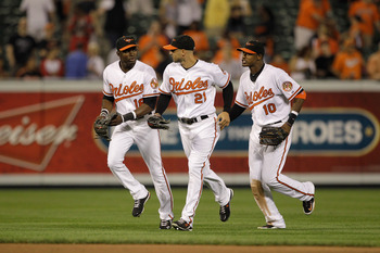
New:

Along with the cartoon bird coming back, a multi-colored hat is in use in MLB for the first time in years. Also, the Orioles will sport an orange alternate jersey for the first time since 1992. While some of these tweaks were clearly inspired by a retro movement, they also played up the orange and white, which in turn downplayed the black in their colors.
Much like Baltimore, the Toronto Blue Jays brightened up their color scheme by going wit a retro look themselves:
Old:

New:
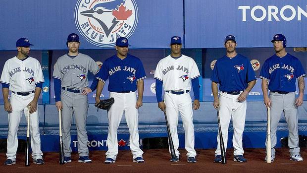
Yet again, the shift from darker to lighter is obvious. I hated the Jays uni design for years, so this change is an extremely welcome one by me. The maple leaf pops, and everything in general looks real sharp on their new duds.
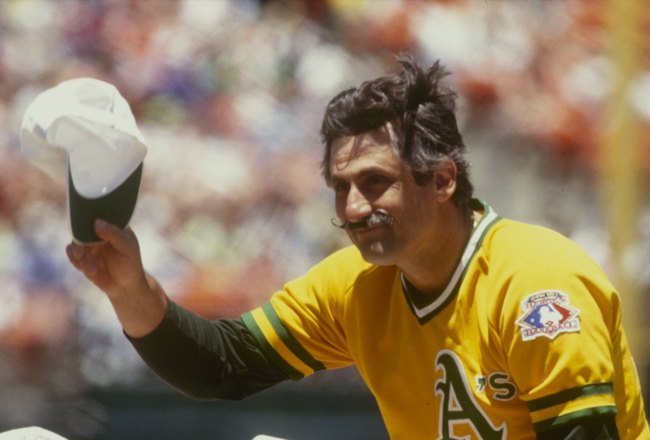
Shifts don't happen overnight, and these teams did not make their changes in a vacuum. The Giants debuted orange uniforms in their 2010 championship season. The Mariners brought back their teal jerseys in 2011, after they proved to be popular in a 2010 throwback game. The Athletics featured an athletic gold alternate last year, which certainly brought back memories of some of their glory days. The Rangers started wearing their red caps more often, over their blue ones. The Angels have been sticking an overdose of red in our faces for approaching a decade.
Color is popular once again in baseball. It's been coming back, but the tide turned for good this past week. You're on the clock, Pirates.
No comments:
Post a Comment